Media Units: Proportion, Balance & Placement
A well-designed media unit does far more than house a television.
It anchors a room, defines the elevation, manages visual weight, and introduces joinery as an architectural element rather than simply storage.
This guide explores the principles we use when designing bespoke media units across Oxfordshire, London and the Home Counties, helping you understand what works — and why.
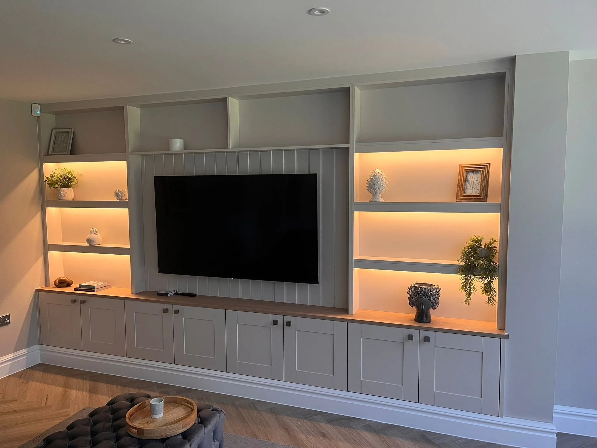
Spray painted media Unit with shaker doors , tongue and grooved centre panel and LEd strips lights with 36mm shelving
Understanding Proportion in Media Units
Start With the Wall, Not the TV
Before you think about cabinetry or shelving, step back and look at the wall itself.
Ask:
How wide is the wall?
Where does the eye naturally settle?
Should the media unit stretch wall-to-wall?
Or sit as a framed, sculptural piece?
A well-designed media unit begins with understanding the geometry of the room. When the TV dictates the composition, the design always feels compromised. Let the wall guide the layout — then the TV is simply absorbed into the architecture.
Proportion Is Everything
Balancing Storage with Visual Calm
Media units are about balance — between open and closed storage, between filled and empty space, between vertical and horizontal lines.
Consider:
Horizontal emphasis
Long, low units create calm, contemporary lines.
Ideal for modern living rooms and open-plan spaces.
Vertical emphasis
Tall shelving or asymmetrical uprights add movement and architectural interest.
Great for high ceilings or to counter wide rooms.
The sweet spot
Most successful media units use one dominant direction (horizontal or vertical) and support it with subtle opposing lines.
Too many mixed directions create visual noise.
TV Placement: Blend, Don’t Dominate
The television should feel integrated, not like an afterthought.
Best approaches:
Position the TV centrally within the elevation
Surround it with balanced, symmetrical storage
OR intentionally offset it within an asymmetrical composition
Use a dark background panel to reduce visual contrast
Hide cables within stud walls or pre‑planned cavities
A TV framed correctly feels architectural.
A TV floating on a plain wall feels accidental.
Materials: The Difference Between Standard and Bespoke
High-end media units rely on materials that bring tactility and warmth.
Strong choices:
Oak or walnut veneer
Adds texture, depth and natural variation.Smooth painted finishes
A clean, architectural look that suits contemporary interiors.Fluted or slatted panels
Perfect for hiding speakers or adding rhythm.Matte laminates or soft-touch finishes
Give a modern, refined feel without being cold.
Materiality is often what elevates a media unit from “functional” to “focal.”
Open vs Closed Storage: Strike the Balance
The key is not how much storage you include, but how you reveal it.
Open shelving
Best for display, styling moments, books, or architectural objects. Closed cupboards
Hide clutter, consoles, media boxes and cables — essential for calm spaces.
Drawers
Perfect for remotes, accessories, games, and everything you don’t want visible.
Designer rule of thumb:
60% closed, 40% open creates a refined, balanced elevation.
Depth Matters More Than People Realise
Most media units look bulky because they’re built too deep.
Ideal depths:
300–400mm for display shelving
450–550mm for cupboards storing tech or large items
As slim as possible for wall-mounted units
Deeper sections should be visually balanced with lighter elements
Architecturally, varying depths adds sophistication — but only if the transitions are intentional.
Lighting: The Quiet Luxury
Lighting transforms a media unit into a feature.
Best lighting techniques:
LED strips inside open shelving (warm white, never cool)
Backlighting behind slatted panels
Soft wash lighting above or below the unit
Integrated lighting within niches
Great lighting feels invisible.
If you can see the strip, it’s not good lighting.
Managing Tech: Architectural Concealment
High-end joinery hides what you don't want to see:
Cable routes built into the carcass
Ventilated cupboards for media equipment
Recessed soundbars
Acoustic fabric panels
Hidden charging drawers
Hinged access panels for wiring
Architects and designers love practicality that doesn’t compromise the visual elevation.
Free-Standing vs Built-In: What’s More Premium?
Built-In Units
seamless
architectural
part of the space
visually calm
perfect for awkward rooms
higher-end feel
Free-Standing Units
better flexibility
good in rental or multi-use spaces
less integrated
For high-end homes, built-in is almost always the preferred choice.
Final Thoughts
A media unit isn’t just storage — it's an architectural element that shapes the atmosphere of a room. When proportion, materials, lighting and composition work together, the result is elegant, functional and timeless.
For homeowners, designers and architects, we offer:
elevation design
material specification
integrated lighting solutions
bespoke joinery
installation with architectural precision
If you’re planning a media unit or want help designing the perfect elevation, we’d love to collaborate.
Explore our fitted wardrobes sliding doors room dividers and dressing Rooms
Ready to plan your own space? Book a design visit or send us your measurements to begin.